Welcome back to the blog, today I continued research for my film intro. Today I researched opening credits. The opening credits are an important part of crafting a successful film introduction as they list all of the films creators. Over the years there have been many different ways that opening credits functioned, originally they were static title cards that were placed before movies however they have since evolved to a dynamic part of the film.
The order of the credits is an important element of making them effective. For instance the typical order starts with the production company, director, film title, lead cast, supporting cast, casting director, music composer, costume designer, editors, production designer, executive producer, writers, and ends with the director. This order can be edited and changed to fit the movies style. For instance in some films the title is placed at the end of the film. However, for the case of our own film introduction I intend to stick with the normal order of opening credits.
The end of
The Dark Knight showing the title at the end rather than the beginning.
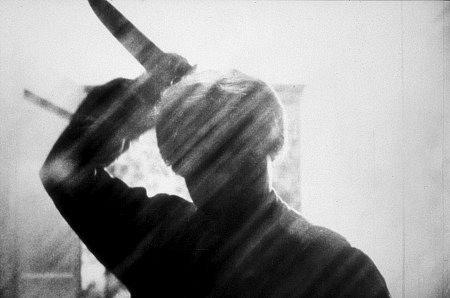
The font of the opening credits also plays an important role in conveying meaning within the film introduction. Various different fonts can be used in order to signify the genre and theme of the film such as a cursive font being used to signify a romance or a heavy, bold font being used to set the ground for an action film. For a horror film there is a variety of different types of fonts that can be used. For example in Se7en a scribled, sketchy font is used to match the violent thriller story and match the graphic imagery of the opening scene. This style of font can work well if we decide to make a faster paced film introduction with many jump cuts and harsh editing.
An example of the font used in opening credits of
Se7en.
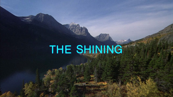
Another type of font that can be used in a horror film's opening credits is using a simple font. This can be best show in The Shining where during the opening scene the credits are seen as a rolling list done in a simple Helvetica font. While the font itself doesn't scream horror it blends with the drone footage of a car driving on a mountainous road, and the disturbing music being played. The sharp contrast between the simplistic font and the overall theme of the movie helps to inflict fear amongst its viewers. This can be implemented into our own film introduction if we use a more straightforward visuals with limited harsh jumps and strong edits.
The font used in the opening credits of
The Shining.
The opening credits of our film introduction should be able to match the style of the film and be able to properly reflect the style of the visuals. The timing that they appear onscreen and order must be carefully chosen as well as the order they appear in to be viewed as effective. The font should also reflect the visuals as to make it as seamless as possible. I instead to take all of these in account whilst creating our film introduction and in the meantime I intend to continue my research.
Below is a list of sources that I used to conduct research: